PORTO FINO
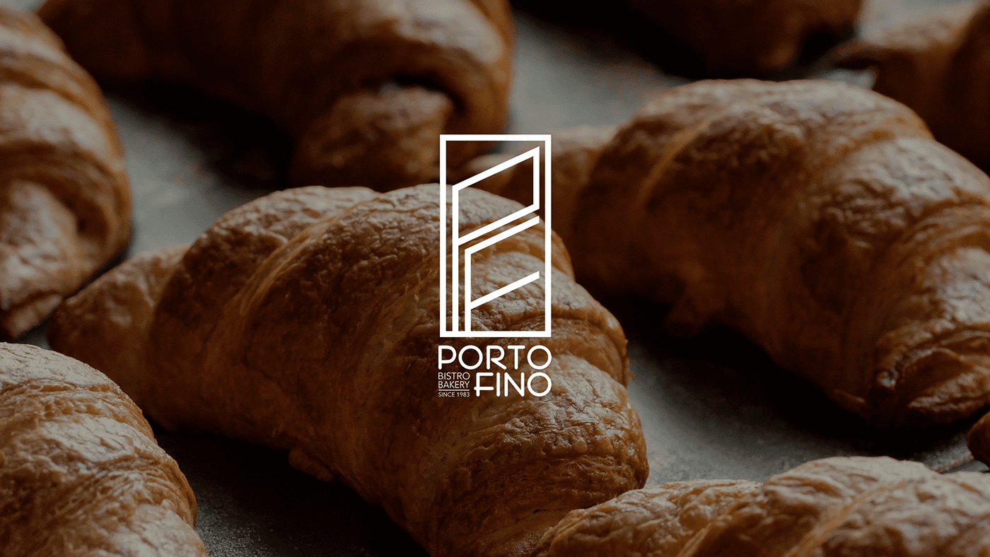
PORTO FINO PORTO FINO is a bistro bakery establishment. The brand’s logo embodies a skillful amalgamation, incorporating the wheat motif that serves as a symbolic representation of the bakery’s essence. Simultaneously, it seamlessly integrates the initials “P” and “F,” denoting the identity of the brand. Moreover, these initials cleverly encapsulate…
KONG-A
KONG-A Konga is a local Egyptian clothing brand that draws inspiration from gorillas. The term “Konga” is associated with gorillas, which are symbolic of compassion, fondness, and gentleness. Additionally, gorillas are renowned for their friendly and emotional nature. The visual features a background resembling the gorilla’s habitat. The brand name…
KAY
KAY Kay, is compound by ALKARMA Developments, embodies a compelling brand symbol that seamlessly blends a heartbeat and a flow diagram. This emblem stands as a living pulse, representing Kay as the central hub of connectivity. The emblem’s colors mirror the vibrant spectrum of car lights, symbolizing Kay’s presence alongside…
NOVELLA
NOVELLA Novella is an Egyptian compound situated in 6th of October, developed by Alkarma Developments. The brand identity of Novella is elegantly depicted through the portrayal of two books, where one book appears open to a specific page. This visual is encased by a protective border, ensuring its distinct visibility,…
PEACOOK
PEACOOK PEACOCK is an elegant restaurant that draws inspiration from the exquisite peacock bird. The restaurant’s logo harmoniously blends the distinctive appearance of the peacock with its vibrant color palette, reminiscent of the bird’s iridescent plumage. This fusion of design elements highlights the restaurant’s goal of providing a unique dining…
iVACCi
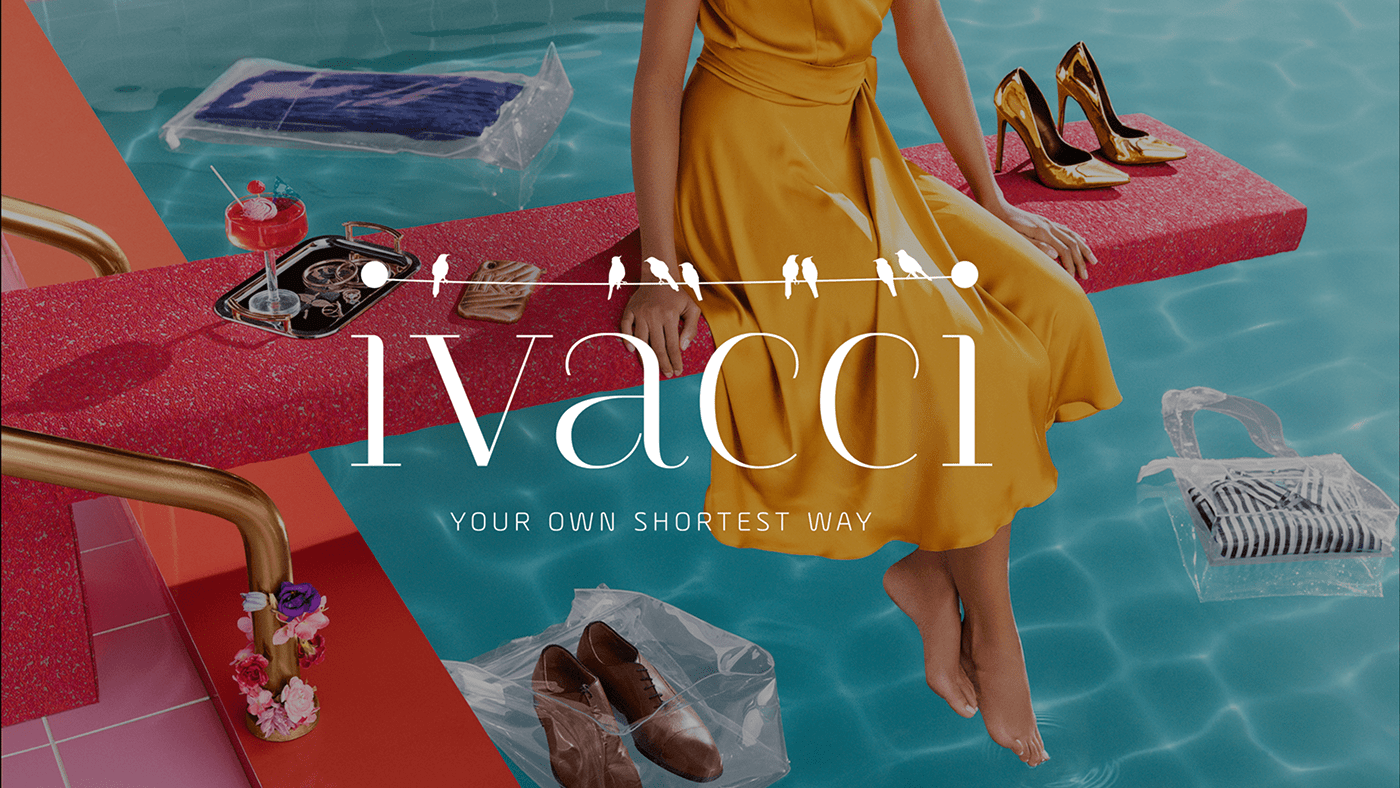
Ivacci Introducing iVACCi branding: Your Own Shortest Way. An endeavor that will redefine the essence of a women’s footwear and bags brand. Here’s a glimpse into iVACCi’s story: The “i” stands for integrity, the “V” for value, the “A” for authenticity and the double “C” stands for competence and creative…
RAQWA
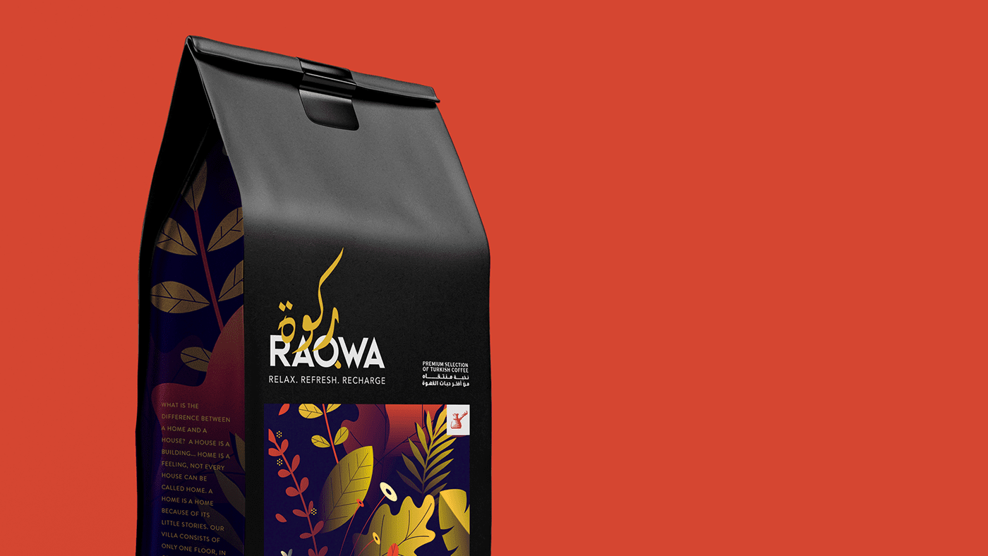
RAQWA Presenting RAQWA coffee branding. The “Q” in the brand name is stylized as a cup of coffee in the logo. The colors yellow, light blue, and pink evoke feelings of focus, refreshment, and recharging, which are all qualities associated with a good cup of coffee. Related Projects PORTO FINO…
YOKOZUNA
YOKOZUNA Yokozuna is a bubble tea brand that draws its name from the prestigious highest rank in professional sumo wrestling in Japan. This nomenclature is employed to signify that the brand offers the most superior and top-ranking bubble tea available in the market. The brand’s logo creatively merges the imagery…
FARARJY
Fararjy FARARJY is a poultry brand. The brand’s logo combines a rooster and mountains, symbolizing vitality, resilience, and a commitment to quality. The rooster represents energy and freshness, while the mountains evoke steadfastness and a connection to nature. This fusion encapsulates FARARJY’s identity, portraying a brand that delivers exceptional poultry…

