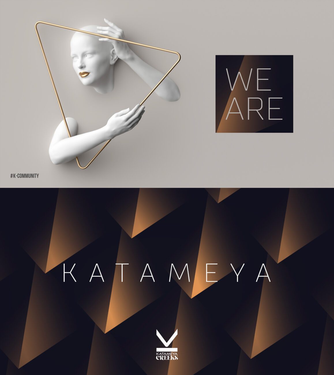
The illustrations for Katameya Compound feature a character positioned within a triangle, which represents the individual’s relationship with the compound. This concept captures the essence of the connection between a Katameya resident and their compound. The line “We are Katameya” serves as a unifying statement, embodying the residents’ collective pride in their membership within the Katameya community. The use of the gold color palette further elevates the design, symbolizing the compound’s luxury.